Strategic Color Blocking Techniques for Interior Spaces
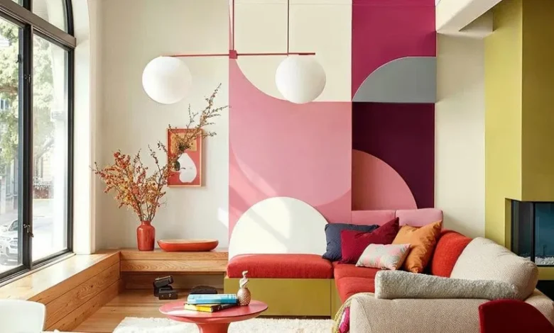
Color blocking is an interior design methodology that pairs contrasting or complementary blocks of color to create a bold, graphic visual statement. Rooted in the early twentieth-century modernist art movement—specifically the geometric abstractions of Piet Mondrian—color blocking has evolved from avant-garde canvas art into a sophisticated tool for spatial manipulation, zoning, and architectural emphasis.
When implemented strategically, color blocking transcends mere decoration. It can visually alter the perceived dimensions of a room, guide human movement, mask architectural flaws, and establish distinct functional micro-environments within open-concept layouts. Achieving these results requires an understanding of color theory, spatial scale, and the psychological impact of geometric forms.
Theoretical Foundations of Color Pairing
The success of any color-blocked scheme hinges entirely on the relationship between the chosen hues. Designers rely on the structural logic of the color wheel to select palettes that evoke specific spatial and emotional responses.
Complementary and Split-Complementary Dynamics
Complementary color blocking pairs hues that sit directly opposite each other on the color wheel, such as deep navy blue and burnt orange, or rich forest green and muted blush pink. This technique creates maximum visual tension and high contrast. To ensure the space remains balanced rather than chaotic, it is crucial to follow a skewed ratio, such as applying one dominant hue across eighty percent of the designated block and utilizing the opposite color for the remaining twenty percent as an accent.
A split-complementary approach mitigates extreme visual vibration. Instead of choosing the direct opposite color, you select the two hues adjacent to it. For example, pairing a deep olive green with soft terracotta and dusty plum yields a rich, sophisticated contrast that feels deliberate and grounded.
Analogous and Monochromatic Harmonization
For a more serene aesthetic, analogous color blocking utilizes hues that sit side-by-side on the wheel, such as sage green, teal, and slate blue. This creates a soft, fluid transition that guides the eye gently across the space without sharp, jarring interruptions.
Monochromatic color blocking relies on varying the saturation, value, and tone of a single base color. By pairing a pale linen gray with a mid-tone charcoal and a deep, moody obsidian, you introduce structural depth and architectural layers to a room while maintaining absolute color cohesion.
Spatial Manipulation and Architectural Zoning
Beyond aesthetics, color blocking functions as a powerful tool for correcting architectural shortcomings and defining layout boundaries without physical partitions.
Altering Spatial Perceptions
Color possesses physical weight and alters how light bounces within a room, meaning it can be weaponized to change how large or small a room feels.
-
Lowering High Ceilings: In vast, cavernous spaces or rooms with excessively high ceilings that feel uninviting, color blocking can establish a lower visual plane. Painting the upper third of the walls and the ceiling in a rich, dark hue like terracotta or charcoal while keeping the lower two-thirds a crisp white visually brings the ceiling down, making the room feel cozy and grounded.
-
Expanding Narrow Corridors: For long, restrictive hallways, color blocking the far end wall in a prominent, advancing color like deep teal or mustard yellow draws the eye forward, effectively foreshortening the hallway and making the side walls feel further apart.
-
Raising Low Ceilings: Applying a strong vertical block of color that runs uninterrupted from the baseboard, straight up the wall, and slightly bleeds six inches onto the ceiling draws the eye upward, cheating the mind into perceiving greater vertical clearance.
Functional Zoning in Open-Concept Layouts
As modern residential architecture continues to favor open floor plans, the lack of physical walls can leave spaces feeling unanchored and chaotic. Color blocking solves this by establishing clear functional micro-zones.
-
The Home Office Niche: You can define a workspace tucked into a living room corner by wrapping a crisp geometric block of color—such as a deep sage rectangle—across both intersecting walls and the floor area directly behind the desk. This creates a distinct mental and visual boundary for work hours without breaking the flow of the room.
-
Dining Area Anchoring: Instead of relying on a traditional area rug to frame a dining table, a bold vertical stripe of color can be painted up the wall and extended directly across the ceiling over the dining set. This acts as a canopy of color, isolating the eating area from the surrounding kitchen and living spaces.
Geometric Execution and Technical Precision
Implementing color blocking requires careful attention to crisp lines, scaling, and the structural lines of the room. Poor execution can result in a space that feels unfinished or haphazard.
Choosing Your Shapes and Formats
The geometry you choose should complement the existing lines of your architecture.
-
Rectilinear Blocking: Squares and rectangles are the easiest shapes to integrate because they mirror the structural grid of windows, doors, and walls. They instill a sense of stability, order, and classical balance.
-
Arches and Circles: Incorporating organic, curved blocks of color softens harsh architectural lines. Painted arches are highly effective behind headboards, flanking doorways, or framing freestanding shelving units, introducing softness and movement to rigid rooms.
-
Diagonal and Graphic Splices: Angular, diagonal color blocks inject high energy and movement. These are best utilized in transitional spaces like stairwells, entryways, or creative playrooms, where dynamic visual pacing is desired.
Edges and Boundary Definitions
The boundary where two colors meet dictates the overall vibe of the design.
-
Hard-Edge Precision: This is the most common technique, achieved by using high-quality painter’s tape to create razor-sharp, flawless lines. Hard edges deliver a clean, graphic, and highly modern architectural finish.
-
Deconstructed Soft Edges: For an organic or artisanal look, you can deliberately skip the tape and apply the second color with a dry-brush technique, leaving a textured, frayed boundary line. This works beautifully in bohemian or rustic spaces, softening the contrast between the color zones.
Materiality, Lighting, and Texture Integration
Color does not exist in a vacuum; its appearance changes constantly based on surface textures and the light sources reflecting off of it.
Light Absorption and Reflection
Before finalizing the boundaries of your color blocks, you must analyze the natural and artificial light patterns of the room.
-
Matte and Flat Finishes: These finishes absorb light uniformly, making them ideal for deep, dark color blocks. A matte finish minimizes surface imperfections and ensures that the color block looks rich, consistent, and velvety from every viewing angle.
-
Satin and Semi-Gloss Finishes: These surfaces reflect light, making colors appear brighter and more dynamic. If you color block using a semi-gloss paint next to a flat paint of the same hue, the light reflection alone will create a subtle, sophisticated block effect without needing a second color.
Translating Color Blocking to Architectural Materials
Color blocking is not restricted to paint on drywall. True material blocking integrates different textures to elevate the tactile quality of the space.
-
Wood Panel Splicing: Combining a smooth, painted drywall surface with a sharply defined block of vertical oak slats creates a multi-dimensional color block that introduces organic warmth and physical depth to the wall.
-
Tile and Textile Zoning: In bathrooms and kitchens, color blocking can be achieved by running a dense block of colored ceramic subway tiles directly next to a smooth, monochromatic plastered wall. In living spaces, heavy velvet drapery can be hung to align perfectly with a painted wall block, continuing the color plane through textiles.
Advanced Strategies for Experienced Design
For those looking to push past simple wall shapes, advanced color blocking integrates furniture and transitions between rooms to create a fully immersive environment.
The Immersive Three-Dimensional Block
Instead of treating the wall as a flat canvas, advanced color blocking treats the entire room as a three-dimensional volume. This involves painting the wall, the baseboards, the window trims, the interior doors, and even custom built-in cabinetry the exact same color within the designated block. This cohesive saturation creates a seamless, built-in architectural look that minimizes visual clutter and elevates the luxury feel of the interior.
Inter-Room Transitions and Thresholds
Color blocking can be used to choreograph the journey through a home. By painting a small entryway or transition hallway in a dark, enveloping color block, the adjacent living room will feel instantly larger, brighter, and more expansive the moment a person steps through the threshold. This play on compression and release utilizes color to control the psychological experience of moving through architectural thresholds.
Frequently Asked Questions
How do I determine the correct scale and height for a horizontal color block in a standard room?
For a standard room with eight-foot ceilings, a horizontal color block should generally follow the rule of thirds. Placing the horizontal dividing line at roughly thirty-six inches from the floor mirrors traditional wainscoting heights and feels naturally balanced to the human eye. Alternatively, aligning the top edge of the color block perfectly with the top casing of your interior doors or windows creates a strong, continuous architectural horizon line that grounds the entire space.
Can color blocking be effectively executed in a rental home without painting the walls?
Yes, you can achieve a sophisticated color-blocked effect using non-permanent methods. Removable peel-and-stick wallpaper can be cut into precise geometric shapes, arches, or stripes and applied directly to the walls. Additionally, you can utilize large scale geometric area rugs, modular furniture arrangements, and oversized unframed canvases painted in solid hues hung side-by-side to block out color zones without violating lease agreements.
What is the best way to handle outlets and switch plates that fall inside a painted color block?
To maintain the clean, graphic integrity of a color block, outlets and switch plates should never break the color field. You should purchase paintable faceplates and paint them, along with the mounting screws, in the exact color of the block they reside in. For the outlet receptacles themselves, select manufacturers that offer hardware in matching tones like charcoal, bronze, or cream so they blend seamlessly into the background.
How do I prevent paint from bleeding under the tape when creating crisp color blocks?
To ensure sharp lines, apply a high-quality painter’s tape along your measured pencil line and press the edges down firmly with a plastic putty knife or your fingers. The professional secret is to seal the edge of the tape by painting over it with your base wall color first. This allows any inevitable bleeding to occur using the background color. Once dry, paint your new block color over the top. When you peel the tape away, your line will be absolutely flawless.
Should art and wall decor be hung inside a color-blocked section?
Decor can absolutely be placed within a color block, but it must be curated with intent. If you place artwork inside a color block, ensure the artwork scale fits comfortably within the boundaries of the shape, leaving at least a four-to-six-inch border of the block color around the frame. The frame should ideally contrast with the block color to stand out, or match it precisely for a minimalist, sculptural look.
How does color blocking affect the resale value of a residential property?
While highly personalized, vibrant color blocking can sometimes deter traditional home buyers who prefer neutral spaces, it does not permanently harm property value because paint is easily reversible. If you are preparing a home for market, color blocking executed in sophisticated neutral tones—such as warm taupe paired with cream, or soft slate gray paired with white—can actually highlight architectural features and make a home look professionally styled, increasing its market appeal.


