Interior Styling Mistakes Homeowners Should Always Avoid Carefully

Decorating a home is a deeply personal journey, an opportunity to translate individual tastes, memories, and functional needs into a physical environment. However, without a foundational understanding of scale, lighting, and spatial planning, even the most well-intentioned interior styling projects can go awry. Many homeowners fall into common design traps that inadvertently make spaces feel cluttered, disjointed, or uncomfortable.
Achieving a professionally styled look does not require a massive budget; rather, it demands careful attention to detail and a willingness to avoid instinctual but flawed decorating habits. By identifying and correcting these widespread styling missteps, you can unlock the true architectural potential of your living space and create a balanced, cohesive sanctuary.
Scale and Proportion Disconnects
One of the most frequent errors in residential interior styling is a fundamental misunderstanding of scale and proportion. Furniture and decor items do not exist in a vacuum; they must relate harmoniously to the physical dimensions of the room they occupy.
The Catalog Showroom Syndrome
A common mistake occurs when homeowners purchase an entire matching set of furniture directly from a single catalog or showroom floor. While this approach seems convenient, it eliminates visual texture and makes a room feel rigid and corporate.
-
Dimensional Monotony: Matching sets often feature the exact same height, depth, and material composition. A living room with a matching sofa, loveseat, armchair, and coffee table lacks the varied silhouettes necessary to keep the eye moving constructively throughout the space.
-
Overcrowding Small Footprints: Showroom floors are massive spaces with soaring ceilings. When oversized sectionals or bulky media centers are brought into a standard residential room, they swallow the available floor area, choke natural traffic pathways, and create a claustrophobic atmosphere.
Improper Rug Sizing
An undersized area rug is an instant detractor from a room’s overall aesthetic, often referred to by designers as the floating island effect.
-
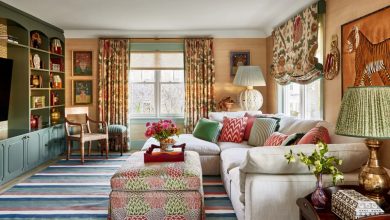
The Living Room Rule: In a living room, a rug should anchor the seating arrangement. A common mistake is buying a small rug that sits solely under the coffee table. To establish proper scale, the rug must be large enough so that at least the front legs of all major seating pieces rest securely on top of it.
-
The Dining Room Rule: For dining spaces, the rug must extend at least twenty four inches beyond the edge of the table on all sides. This ensures that when guests pull their chairs out to sit down, the chair legs remain on the rug surface rather than catching on the edge.
Lighting and Atmospheric Miscalculations
Lighting is the invisible backbone of successful interior styling. It dictates how colors are perceived, how textures register tactilely, and how comfortable a room feels at various times of the day.
Relying on a Single Overhead Light Source
Many homeowners rely entirely on a single, centrally located flush-mount ceiling fixture to illuminate an entire room. This approach creates a harsh, flat, and clinical environment with deep shadows in the corners.
-
The Three-Layer Rule: Professional styling requires a layered lighting strategy comprising ambient, task, and accent lighting. Ambient lighting provides general illumination, task lighting focuses on specific work zones like reading chairs or kitchen counters, and accent lighting highlights artwork or architectural features.
-
The Power of Sconces and Lamps: Integrating eye-level light sources, such as table lamps, floor lamps, and wall sconces, creates a warm, diffuse glow that softens boundaries and makes a room feel instantly more inviting.
Incorrect Bulb Temperature Choices
The color temperature of light bulbs is measured in Kelvins, and choosing the wrong output can completely ruin a carefully selected paint color or textile palette.
-
The Clinical Daytime Trap: Using daylight bulbs ranging from five thousand to six thousand Kelvins in a cozy living room or bedroom can make the space feel sterile, cold, and blue, akin to a commercial hospital setting.
-
The Amber Slumber Trap: Conversely, using overly warm bulbs below twenty five hundred Kelvins throughout a functional home office or kitchen can cause the environment to look dingy, yellow, and poorly lit. Aim for a balanced warm white between twenty seven hundred and three thousand Kelvins for general living areas.
Spatial Flow and Wall Decor Disruption
How movement occurs through a space and how items are anchored to the walls heavily influences the psychological comfort of a home.
Pushing All Furniture Against the Walls
When faced with a small or medium-sized room, the natural inclination for many homeowners is to push every single piece of furniture flush against the perimeter walls in an effort to maximize the central floor space.
-
The Waiting Room Effect: This layout strategy creates an awkward, cavernous void in the center of the room and forces people sitting down to shout across the expanse to converse.
-
Floating for Intimacy: Pulling seating away from the walls, even by just six to twelve inches, creates a dynamic known as floating the furniture. This instantly introduces an air of sophistication, improves air circulation perception, and establishes intimate conversation groupings.
Hanging Artwork Too High
Walking into a home where the artwork is perched near the ceiling line is a glaring styling error that disrupts the visual balance of the entire wall.
-
The Eyeline Standard: As a general rule of thumb, artwork should be hung so that the center of the image sits at approximately sixty inches from the floor, which represents the average human eye level.
-
The Anchor Connection: When hanging art above a piece of furniture, such as a sofa or a sideboard, the bottom of the frame should sit roughly six to eight inches above the top of the furniture piece. If the gap is too large, the artwork loses its connection to the furniture and appears to be floating away aimlessly.
Accessorizing and Surface Overload
Accessories add personality to a space, but an undisciplined approach to decor surfaces can quickly cross the line from curated to cluttered.
The Clutter Accumulation Mistake
Displaying every single knick-knack, souvenir, and family heirloom simultaneously creates a chaotic visual environment where no single object can be appreciated.
-
The Art of Editing: Successful interior styling relies heavily on the concept of negative space, which is the empty area around an object. Negative space gives the eye a place to rest and allows high-quality pieces to truly stand out.
-
The Rule of Threes: When arranging accessories on a mantel, coffee table, or bookshelf, group items in odd numbers, specifically trios. Vary the height, texture, and shape of the three objects to create a compelling visual pyramid. For instance, pair a tall candlestick with a medium-sized vase and a low, flat book stack.
Ignoring Window Treatment Proportions
Windows are the eyes of a home, and hanging drapery incorrectly can make a room feel short, dark, and structurally stunted.
-
The Low-Hung Rod Deficit: Mounting curtain rods directly onto the top window trim cuts off the vertical line of the wall, making the ceiling feel significantly lower than it actually is.
-
High and Wide Mounting: To create the illusion of grand scale, mount curtain rods as close to the ceiling or crown molding as possible, ideally three to six inches below the ceiling line. Additionally, extend the rod outward past the window frame by twelve to eighteen inches on each side. This allows the drapery panels to sit entirely on the wall when open, exposing the full glass window pane and maximizing natural light infiltration.
Frequently Asked Questions
How can I make a long, narrow living room feel balanced without creating a bowling alley effect?
To break up the visual length of a narrow room, avoid lining all your furniture along the long walls. Instead, divide the room into two distinct functional zones, such as a primary conversational seating area anchored by an area rug, and a secondary reading nook or small workspace at the far end. Utilize circular coffee tables or rounded armchairs to contrast with the sharp rectangular lines of the architecture, which helps soften the directional flow of the room.
Should I choose a paint color first or select my furniture fabrics before painting a room?
You should almost always select your primary furniture pieces, textiles, and rugs before finalizing your wall paint color. Fabric options, high-quality rugs, and statement sofas are limited in color availability, whereas paint can be custom mixed into thousands of different shades and undertones. It is substantially easier to match a paint color to a specific thread in a woven rug than it is to find a rug that perfectly matches a pre-painted wall.
How do I accurately mix different wood tones in a single room without it looking mismatched?
Mixing wood tones is encouraged because it makes a space feel evolved over time, but you must establish a dominant wood tone to act as the anchor. Once your primary tone is selected, choose one or two accent wood tones that offer clear contrast. For example, if you have light oak floors, you can introduce dark walnut or black-stained wood accents. Ensure you match the underlying temperature of the woods, pairing cool undertones with cool undertones, or warm with warm, to maintain visual harmony.
What is the most effective way to choose throw pillows without making a sofa look messy?
Avoid buying pillows made of the exact same fabric as your sofa, as this creates a flat look. Instead, select a cohesive color palette of three colors derived from other elements in the room, such as an artwork or an area rug. Vary the scale of the patterns and textures: choose one large-scale pattern, one small-scale pattern or geometric print, and one solid, highly textured fabric like velvet or linen. Limit the total quantity so that guests do not have to move the pillows to find a comfortable place to sit.
How do I handle a television so it does not become the ugly focal point of the living room?
There are several strategic styling techniques to minimize the visual impact of a black television screen. You can mount the television on a dark-painted feature wall, which allows the screen to blend into the background when turned off. Alternatively, incorporate the television into a larger gallery wall arrangement surrounded by framed artwork, or utilize modern frame-style televisions that display high-resolution digital art when the device is not actively in use.
What is a common mistake people make when styling an open-concept living and dining zone?
The biggest mistake in open-concept spaces is failing to create visual continuity while maintaining distinct boundaries. Homeowners often treat the zones as completely separate entities with clashing color schemes, or they make them too identical, resulting in a sterile environment. The correct approach is to use consistent flooring and a unified wall color throughout the entire footprint, but use distinct area rugs, localized lighting fixtures, and varied furniture arrangements to subtly define the unique purpose of each micro-zone.