Mixing Patterns Carefully for Cohesive Interior Aesthetics Results
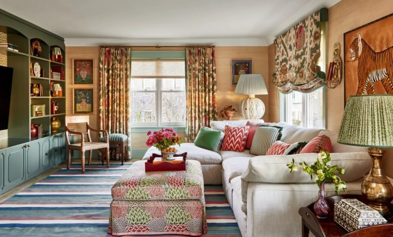
Integrating multiple patterns within a single interior space is one of the most effective ways to transition a room from a generic showroom aesthetic to a deeply personalized, professionally curated environment. Patterns introduce visual texture, movement, and structural rhythm to a home. However, many homeowners shy away from this design strategy out of fear that combining different prints will result in a chaotic, visually jarring environment that causes sensory overload.
Achieving a successful, cohesive blend of patterns requires moving beyond guesswork and adhering to established design principles. When executed with deliberate intent and technical precision, a multi-patterned space feels balanced, sophisticated, and unified. By mastering the relationships between scale, color temperature, and print classification, you can confidently layer diverse motifs to elevate the aesthetic value of your living space.
The Rule of Three and Scaling Hierarchy
The foundation of pattern mixing rests upon creating a clear structural hierarchy. When too many prints compete for the same level of attention, the human eye cannot find a place to rest, which creates psychological tension. To prevent this, designers rely on a structured hierarchy of scale, traditionally executed through the rule of three.
The Primary anchor Pattern
The first pattern selected sets the tone for the entire room and must serve as the unequivocal anchor of the space. This print should be the largest in scale and should occupy a prominent piece of real estate, such as a large area rug, primary floor to ceiling drapery panels, or an accent wall. Because of its expansive scale, this anchor pattern will introduce the foundational color palette that dictates all subsequent design choices in the room.
The Secondary Complementary Pattern
The second pattern must contrast sharply with the anchor print in both scale and geometric structure. Typically, this secondary selection should be roughly half the size of the primary pattern. If your anchor print is an oversized, organic floral motif, the secondary print should be a medium scale, geometric option—such as a crisp stripe, chevron, or plaid. This structural opposition prevents the two patterns from bleeding together visually, ensuring that each print retains its distinct identity.
The Tertiary Accent Pattern
The third pattern acts as the unifying detail that ties the entire composition together. This print should be the smallest in scale, featuring a tight, intricate motif like a small scale ikat, dots, or a subtle animal print. The tertiary pattern is best deployed on smaller accent pieces, including throw pillows, small ceramic accessories, or lampshades. Crucially, the tertiary pattern must incorporate at least one or two primary colors from the anchor pattern to establish an undeniable visual bridge.
Color Continuity and Palette Management
While varying the scale of your prints prevents physical crowding, managing your color choices is what ultimately binds disparate patterns into a cohesive aesthetic unit. A unified color story can make completely unrelated motifs look like they belong to the same intentional collection.
The Common Thread Strategy
The most reliable method for successful pattern integration is utilizing a common thread color. You can combine an eclectic mix of stripes, florals, plaids, and abstract geometric shapes as long as every single pattern features the exact same background or accent hue. For instance, pairing a black and cream ticking stripe with a large scale black and cream botanical print works beautifully because the stark color continuity instantly neutralizes the conflict between the organic and geometric shapes.
Grounding with Solid Tones
An environment saturated entirely with patterns will quickly feel claustrophobic, regardless of how perfectly the scales are balanced. Solid blocks of color act as essential palate cleansers for the eyes, providing necessary negative space.
-
The Sixty Thirty Ten Ratio: Dedicate sixty percent of the room to a solid background color, thirty percent to your patterned textiles, and ten percent to a concentrated accent color.
-
Textural Solids: When choosing solid fabrics to sit alongside your patterns, opt for heavy textures like linen, velvet, or boucle. These tactile surfaces add depth and interest without introducing competing lines or shapes.
Balancing Geometric and Organic Forms
Patterns generally fall into two broad classifications: geometric, which feature sharp, calculated lines, and organic, which mimic the fluid, irregular shapes found in nature. A well-designed room must strike a balance between these two opposing forces.
Structuring with Geometrics
Geometric patterns provide structural order and stability to an interior space. They anchor a room, making it feel grounded and architectural.
-
Stripes as Neutral Baselines: Classic stripes, especially two tone awning stripes or delicate pinstripes, function almost as neutrals in the design world. They pair seamlessly with virtually any other pattern style and help elongate or widen a room depending on their orientation.
-
Plaids and Grids: Plaid, houndstooth, and windowpane grids introduce a sense of heritage, traditional symmetry, and masculinity, which helps counterbalance highly whimsical or decorative styles.
Softening with Organics
Without organic shapes, a heavily geometric room can feel rigid, cold, and overly mathematical. Organic prints introduce movement, emotion, and softness.
-
Botanicals and Florals: Large scale floral arrangements or delicate block printed leaf motifs break up the hard lines of rectangular furniture, introducing an air of natural ease and relaxed elegance.
-
Chintz and Toile: Traditional narrative prints like toile de Jouy feature intricate, illustrative scenes that add historical depth and artistic storytelling to a space, contrasting beautifully with modern, minimalist geometric shapes.
Managing Pattern Densities Across the Room
Distributing your patterns evenly across the physical landscape of the room is just as important as selecting the prints themselves. Concentrating all your patterned pieces in one specific corner while leaving the rest of the room stark and neutral creates a severe visual imbalance that makes the room feel lopsided.
Spatial Dispersal
If you feature a bold, multi patterned seating arrangement in the center of the living room, you must mirror that visual weight elsewhere. You can achieve this by placing a smaller patterned accent item, like a custom upholstered storage bench or a unique patterned Roman shade, on the opposite side of the perimeter wall. This deliberate placement coaxes the human eye to travel smoothly across the entire volume of the space rather than getting stuck in a single zone.
The Transition Principle
When mixing patterns on a single piece of furniture, such as a sofa, implement the transition principle. Avoid layering patterned pillows directly against a heavily patterned sofa fabric. Instead, place a solid colored throw pillow directly against the patterned upholstery first, then layer your secondary or tertiary patterned pillows over that solid base. This layering technique isolates each pattern, allowing the unique details of each print to be appreciated clearly.
Frequently Asked Questions
Can I mix patterns from different historical design eras within the same room?
Yes, mixing patterns across historical eras is highly encouraged because it prevents a home from looking like a stagnant period piece. To successfully combine a traditional nineteenth century French toile with a mid century modern geometric print, ensure you maintain strict color palette cohesion. Using the exact same color intensity, such as pairing a muted pastel historical print with a similarly desaturated pastel modern shape, ensures the two distinct eras converse harmoniously.
How do I safely integrate a bold animal print without making the space look garish?
Animal prints like leopard, cheetah, or zebra should be treated strictly as tertiary accents or structural neutrals. Due to their dense, organic, and naturally high contrast nature, they command immediate attention. Incorporate them in small doses, such as on a single footstool, a tailored lumbar pillow, or the interior lining of a bookcase. Ensure the surrounding patterns are crisp, understated geometrics to keep the animal print looking sophisticated rather than overwhelming.
What is the maximum number of patterns I should attempt to mix in a standard sized bedroom?
For a standard residential bedroom, capping your selection at three to four distinct patterns is ideal. The bedroom is primarily a space for rest and recovery, meaning visual tranquility is paramount. You can achieve excellent balance by selecting one large scale pattern for the duvet cover or area rug, a secondary medium scale stripe for the window drapery, and one or two small scale accent prints for the bed shams or a small vanity chair.
How does the natural texture of a fabric affect how a pattern is perceived visually?
The physical texture of a substrate can dramatically alter how a print behaves in a room. A geometric pattern printed on a smooth, reflective silk or satin fabric will appear bright, crisp, and high contrast because light bounces off the surface uniformly. The exact same pattern printed on a heavily textured slub linen or rustic burlap will look softer, more muted, and integrated, as the physical weave breaks up the hard printed lines.
Should I avoid pattern mixing entirely if my home has very low ceilings?
You do not need to avoid patterns, but you must choose their orientation strategically. In rooms with low ceilings, prioritize vertical geometric patterns, such as wide awning stripes or vertical trailing vine prints. These linear motifs draw the human eye upward toward the ceiling line, creating the optical illusion of greater vertical height. Avoid using heavy, dark horizontal bands of patterns, which can visually compress the room.
How do I determine if a pattern qualifies as a busy print or a quiet print?
The volume of a pattern is determined by its density and contrast level, rather than just its shape. A quiet pattern features a low contrast color scheme, such as a tone on tone cream damask, where the motif is barely discernible from the background. A busy pattern features a high density of small motifs with sharp color contrast, such as a multicolored micro floral. Busy prints require significant surrounding negative space, while quiet prints can be treated almost like solid surfaces.